Heat mapping

Display your data as a weed density map.
The default view of the STA logger layers (and in the web application) is to show the path of the units and where spraying occurred. This ‘view’ is very much focused on project management as a lot of questions can be answered from this presentation of data like “where did the operators work?”, “where did the operators spray?” and “where didn’t they go?”.
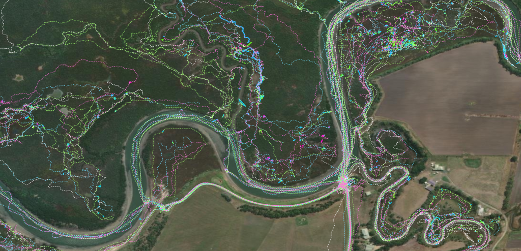
We have recently discussed how you can perform precursory analysis on the STA logger data. This workflow has a data focus. But you might want more of a ‘visual analysis’ or to produce a more visually appealing final product.
Discussed below is how you can use ArcGIS Pro to create a heatmap of your spray data.
Producing a spray intensity map
As this is an ArcGIS Pro workflow, the first step is to add the STA logger layer to ArcGIS Pro using the “Add Data” button. You will see the default view (shown above).
Simply turning off the tracklog data helps clean up the image, but this doesn’t give much an impression of density, as locations that have multiple occurrences of spray data on the same location aren’t obvious.

What we want to do is forget about both of the tracklog and spray zone data and turn on the “points” layers which are turned off by default. The point data is recorded as 1 point per second and records the metrics of what the unit was doing at every moment.
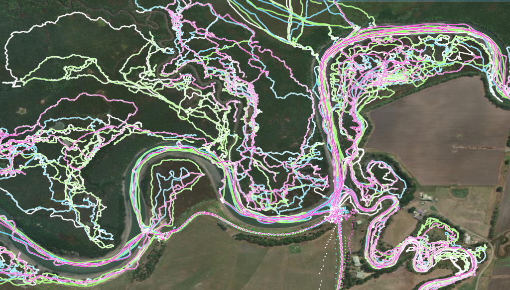
The rest of this workflow can be done on the hosted STA logger layer, but it is recommended that you download and clip the data to a local geodatabase first. Follow the relevant instructions from this blog article to complete that process. The next step is to merge the point layers into one using the “Merge” geoprocessing tool. You can simplify these two steps by simply selecting a group of points for you area of interest, and then running the merge tool on those points (which effectively download and clips the points while merging).
As far as data prep goes, that’s it. As mentioned, if you want to skip this process and perform the visualisation on the hosted layer, you can do that too, this workflow simply improves performance by using local data.
Now we can produce a heat map of the units work area by going into the Symbology tab and changing the symbology to “Heat Map”.
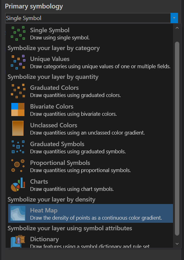
This is what you get:
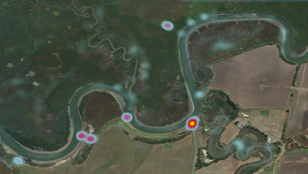
This is a great representation of where the loggers spent their time and may be useful in some circumstances, but this isn’t a representation of where they sprayed. To do that, change the symbology back to “Single Symbol” to start fresh.
Next, right click on the point layer and go into “Properties”, then, “Definition Query”. We want to apply a definition query so that it filters the data and only shows us situations where the trigger is being pulled. The definition query should be:
GPS_Trigger = 1

Once applied, repeat the process to apply the Heat Map symbology and you will get a Heat Map of the density of trigger presses. This also includes duration of trigger presses, because when the trigger is held down, points are continually logged each second. This helps account for different spraying patters from different users.
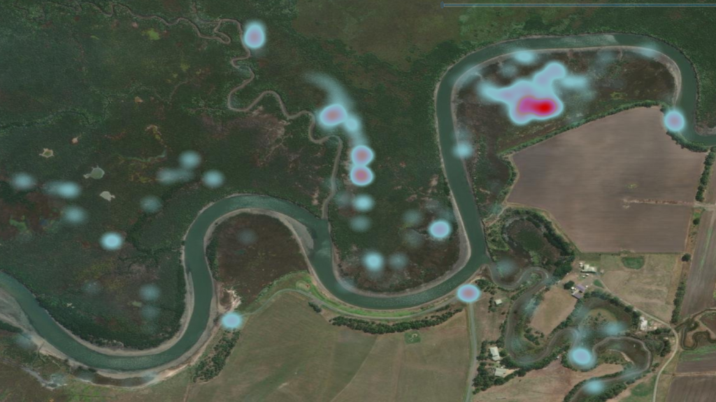
And of course, by changing the Color Scheme, you can produce different outputs depending on your preferences or organisation style guides.
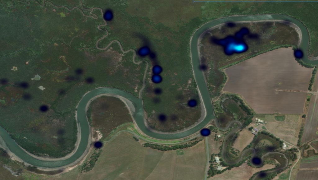

You can also adjust the Definition Query to show different combinations of data like heat maps of individual units, different periods of time, where a certain selector switch was chosen, etc.
This should set you on your way to producing your own weed density maps.
Recent Posts
STA logger onboarding
Read More »
So, why the STA logger?
Read More »
Project and herbicide reporting using the STA logger
Read More »
Why weed control contractors are flocking to use the STA logger
Read More »
